

Reading time: 28 minutes
I’ve been reading a paper about how various methods for EEG biometrics can be used to extract sensitive information about the users such as age or sex. Each method used a different “feature” that can be extracted from the EEG signal of a person and then used for authentication. It was my first introduction to the concept of EEG features, and as the paper contained a list of 16 of them that are commonly used, I’ve decided to go through some of these features and understand them more deeply. Here I will list these features, how they’re extracted, and what they’re used for.
This blog post was written to aid my learning process, and I’m not an expert in EEG data processing. If you’ve noticed any inaccuracies, please let me know!
What data are we working with?
We’re working with “raw” recordings of brain data from EEG. EEG consists of multiple electrodes that are placed in various places on top of the head, each of them recording the strength of brain signal in that area. Most EEG uses between 8 to 64 electrodes, and they’re placed over specific areas we’re trying to examine - e.g. the area responsible for motor movement, visual processing or emotional state.
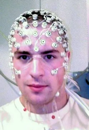
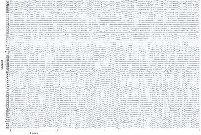
We can just look at this data visually, look for spikes or unusual patterns. That’s called qualitative analysis.
Alternatively, we can do computational analysis, run algorithms on it, and extract features. That’s quantitative analysis. This blog post is focused on different ways of extracting features as part of quantitative analysis.
What are features?
When we extract features, we take some complex and seemingly overwhelming data such as raw brain signals and get something simpler and more elegant out of it. For example, we might split the brain signal into the separate frequencies that compose it, or we can measure how much recordings from different electrodes are correlated to one another (which could indicate that multiple brain regions are working together).
Oftentimes, features are used as digested and organised chunks of data that can be fed into a classifier, e.g. to recognise left or right-hand movement or to guess someone’s age based on EEG recordings. Feeding raw EEG data into a classifier would usually result in a lower accuracy than feeding in features, and some features result in higher classifier accuracy than others.
Now, onto the list of 7 commonly used EEG features:
1. Power Spectral Density
Power Spectral Density splits the EEG signal into all of the separate wave frequencies that compose it, and then calculates how much power each frequency has.
How it’s done
This method uses Fourier Transform - a mathematical tool that breaks down a complex wave (e.g. a sound wave or, in this case, waves representing brain signal strength) into all the base frequencies that compose it.
The Fourier Transform is considered to be one of the most influential tools in maths, physics, and engineering, and it’s used extensively e.g. for removing noise from audio, detecting earthquakes, or image compression.
What is Fourier Transform?
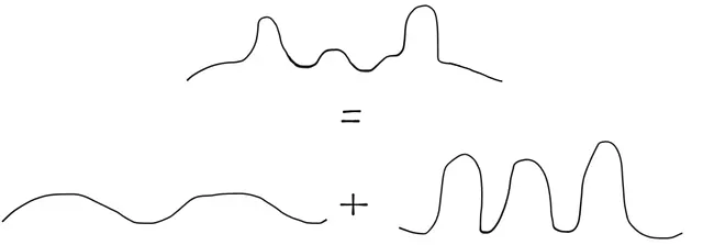
Fourier Transform calculates what underlying frequencies make up a signal and how much they’re present in the signal. It takes a complex wave and outputs all the frequencies that add up to compose it. It’s like taking a piece of music and breaking it down into all the individual instrument sounds that make it up.
The following is a simple hand-drawn example of breaking down a wave that’s composed of 2 underlying frequencies. If the value of these 2 signals would be added up, the result would be the complex wave on top. Fourier transform inverts that process.
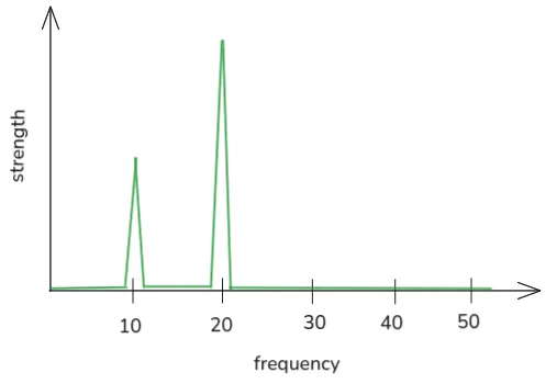
The result of the Fourier Transform is a 2-d graph, where the x-axis represents the frequencies, and the y-axis represents to which extent these frequencies are present in the signal.
As an example, this graph shows that frequencies of 10Hz and 20Hz are present, with the 20Hz frequency being the strongest:
To further understand Fourier Transform, I recommend this Youtube video by 3Blue1Brown.
In the context of EEG, the complex wave picked up by electrodes could be composed by individual waves where e.g. a high frequency wave is caused by someone solving a math problem, and another wave is caused by sensory input from their hand.
In practice, a variation of Fourier Transform called Fast Fourier Transform is used.
What is Fast Fourier Transform?
The result of the Fast Fourier Transform is the same as that of Fourier Transform. However through some clever mathematical shortcuts, it’s possible to cut down the number of calculations that need to be performed, which saves computational power and reduces the time it takes to compute the result. I recommend this Youtube video by Veritasium for a good explanation of Fast Fourier Transform.
What is the extracted feature?
The individual frequencies that compose the signal and how much they’re present.
What can it tell us?
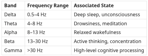
Power Spectral Density can tell us what frequency is the most dominant in the EEG signal, which reveals information about the mental state of the person whose brain signals are recorded. Different frequency ranges are associated with different mental states:
2. Coefficients of the AR model
The AR model tries to fit the data into a model. The coefficients of the model are used as features.
Intermission - What models are used in EEG?
For analysis of EEG data, statistical models are used. These models can be either parametric or non-parametric.
Parametric vs non-parametric statistical methods:
- Parametric: assumes some model about the data. For example in the case of EEG signals, it might assume that the current value of the EEG signal is a linear combination of the previous values plus some noise.
- Pros: Less computationally intensive,
- Con: The data has to follow the assumptions, so it will give incorrect results if the data doesn’t follow them, e.g. if the data has lots of irregular noise.
- Non-parametric: Doesn’t make assumptions about the model of the underlying data.
- Pro: Can be used for any type of data
- Con: Computationally intensive.
Common parametric models in EEG:
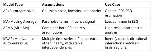
In this case, we’re using the AR model. For AR model, EEG signals can be assumed to be linear in a short period of time, and if there’s no transitions such as seizures or cognitive shifts. The noise is generally assumed to be white Gaussian noise, meaning it has a constant power across all frequencies and follows a normal distribution.
AR model - how it’s done
Autoregressive model assumes that EEG data, for each signal, this signal is a function of all past signals each each multiplied by some coefficient, plus some error.
The AR model is defined as follows:
x_t = a_1 x(t-1) + a_2 x_(t-2) + … + a_p x_(t-p) + e_t
- x_t - the power of EEG signal at this point
- x_(t-1), x_(t-2) etc - the powers of EEG signals at past points in time
- a_1, a_2 etc. - the values by which these past points are scaled (coefficients)
- p - how many past values we’re considering; called the “order” of the AR model
- e_t - the noise at this point
This equation has to hold for every EEG value. This means that the computer has to “figure out” the values of a_1, a_2 etc. such that this equation can be applied to any EEG value along the time axis, and holds.
Extending the model to multiple EEG channels
This equation for AR model assumes that for each point in time, there’s just one EEG value. But usually EEG has multiple electrodes, so there will be as many values as there are electrodes.
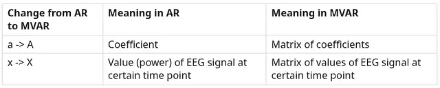
The only 2 differences in the equation for MVAR are as follows:
-
In AR, each x is just a single value of EEG signal at each point in time. But in MVAR, each value of x is not a single value, but a vector holding all signal values, one for each of the N electrodes.
-
In AR, each coefficient describes how the value of a signal at point t depends on the value of the signal at some previous point, e.g. t-1 or t-2. In MVAR, the values of signal also depend on past signal values, but we now have to consider other electrodes. So value x1t will depend on x1(t-1) and x2_(t-1) etc.
- Therefore, each coefficient is a matrix of size N x N. The matrix contains information on how each x (the EEG signal value from a particular channel) depends on every other x (EEG signal values from all other N-1 channels)
- Essentially, entry (i,j) in A_k tells us how much the past value of signal j at lag k contributes to the current value of signal i.
With these 2 modifications, we can calculate the coefficients of an MVAR model. The equation for MVAR is as follows:
X_t = A_1 X_(t-1) + A_2 X_(t-2) + … A_P X(t-p) + e_t
What is the extracted feature?
The list of coefficients of the AR model.
What can it tell us?
The coefficients essentially tell us how much past EEG values influence the current signal.
Rapidly changing coefficients indicate more highly focused mental states and allow for the use of a smaller number of coefficients (lower “order”), because we don’t go as far back to predict the current value. More relaxed states need more coefficients to go back further, as they change more slowly.
3. Common Spatial Pattern
CSP is one of the most commonly used algorithms to extract features in BCIs, and it’s commonly used to prepare data for a classifier. It works on data from 2 classes (e.g. left and right hand movement), and it finds “filters” (which means a way to transform the data) that maximise the variance for one class and minimise it for another.
Then, the filters are applied to new data, and the variance of the result is fed to the classifier. The classifier learns characteristic patterns: some CSP filters produce high variance for class A and low variance for class B, and others do the opposite. These variance patterns allow the classifier to distinguish the two classes.
How does it work?
CSP starts with having 2 sets of labeled data, representing 2 classes, e.g. left and right hand movement, or high vs low attention.
Then, what CSP does is: “It tries to find filters that maximise the variance for one class and minimise it for another”.
To break it down:
- Filter: It’s a way to turn each EEG recording into a numeric value. A filter is a vector, with the size of the vector corresponding to the number of electrodes. If we have an EEG with 4 electrodes, then a filter would take a form f = [f1, f2, f3, f4]. Then the strength of the brain signal recorded at each electrode would be multiplied by the corresponding value (electrode 1 would be multiplied by f1, etc.), the values would be all added together, and the result would be 1 single numeric value.
- Note: this value is calculated over some particular time window (e.g. the time when someone makes either right or left-hand movement, which takes several seconds), rather than calculated for each point in time separately. So it’s not the individual brain signal values that are multiplied by the filter values, but rather it’s all the brain signal values recorded over some amount of time. This is done by calculating the covariance of all data points within that time segment, and then applying the filter to that covariance (rather than applying the filter to all raw data points themselves).
- Variance: strength of the EEG signal - how much it oscillates up and down.
- Classes: two categories that we want to be able to distinguish between, e.g. left vs right hand movement, or high vs low workload.
⟶ Question: Why maximise variance for one, and minimise for another? If we have e.g. left and right hand movements, shouldn’t both of them produce high variance = high oscillations, just in different parts of the brain?
⟶ Answer: Yes, they will both produce high oscillations therefore high variance. But if we’re looking at just one part of the brain, e.g. the part responsible for right-hand movement, then during right-hand movement this part will produce high variance, and during left-hand movement this part will produce low variance. The opposite will be true for the part responsible for left-hand movement. This is how looking for maximum and minimum variance helps in classification.
Graphical overview
EEG has N electrodes. Geometrically, each data point recorded by the EEG can be represented as a point in N-dimensional space. Each point has N-dimensions, where each dimension represents the value from each electrode recorded at that particular time.
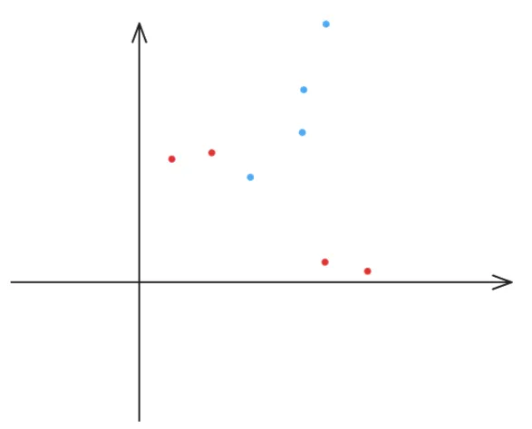
For simplicity, we’ll consider an EEG with 2 electrodes. This means a 2-d graph, where the x-value represents the measurement from one electrode (“electrode x”) and y-value the measurement from the other (“electrode y”).
We’ll consider data from 2 EEG recordings, one of which took place when the subject moved their right hand (red points), and the other when the subject moved the left hand (blue points). The points were arbitrarily chosen by me for simplicity, and don’t represent what an actual recording would look like.
We’ll assume that each recording was recorded over 4 seconds, and a measurement was taken once per second. This resulted in 4 data points for each recording. (In reality, the measurements are taken much more often than once per second.)
For 2 classes, these points will create 2 “clouds” in space. We can draw a “blob” (ellipse) around each group of points to represent the shape of the point cloud:
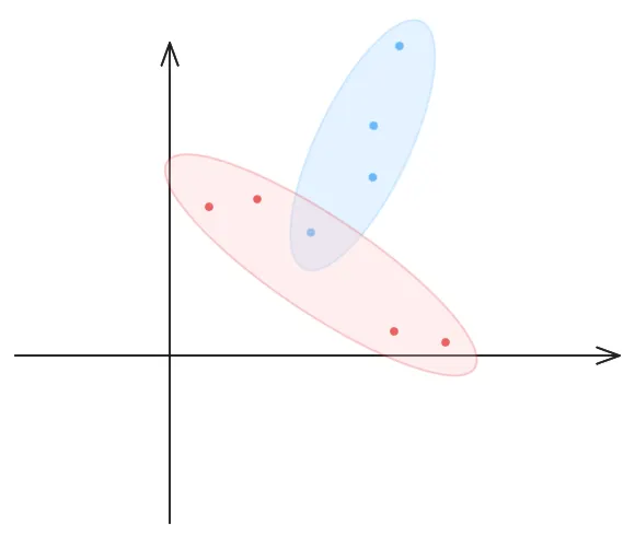
The tilt of the ellipse represents covariance. Covariance represents how much two values are correlated - in this case, it’s how much the x-values (values recorded by electrode x) are correlated with the y-values (values recorded by electrode y).
- If the ellipse tilts upward (like blue ellipse), that means the values recorded by 2 electrodes increase together - indicating high covariance between them.
- If the ellipse tilts downwards (like the red ellipse), that means when the value recorded by one electrode (electrode x) increases, the value recorded by the other (electrode y) decreases - indicating negative covariance.
- The degree of the tilt represents the strength of the positive/negative covariance.
The spread of the ellipse represents variance - it’s the strength of the EEG signal, or how much the values of the recorded signal fluctuate.
- As an example, the blue ellipse is narrow in the x-axis (it’s thin) and it’s wide in the y-axis (it’s long). This means that the values recorded by electrode x don’t fluctuate much (= weak signal), and the values recorded by electrode y have high fluctuations (= strong signal).
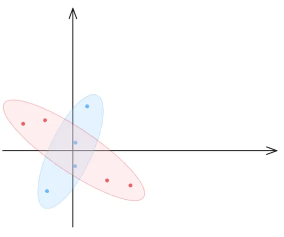
We can then “normalise” the data by anchoring each ellipse in the origin of the graph. This is because we’re not interested in the distances between ellipses, but rather in the difference between their shapes:
A CSP filter is a line in that space, representing direction. For 2 electrodes we have a 2-d space, so a CSP filter will be in the form of a 2-d point [x, y], which represents the line’s direction (the point through which a line will be drawn from the origin).
In this example, a CSP filter is the green line which passes through point [3,6] :
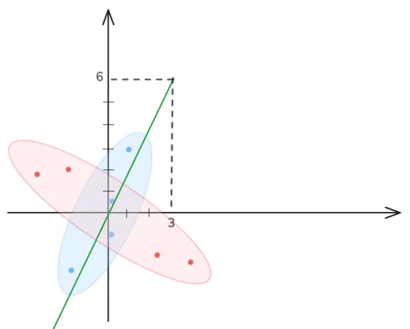
The points representing EEG data points can be projected onto that line, which will “squish” each ellipse into 1 dimension:
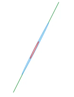
CSP tries to find such a line that when the ellipses are “squished” into it, one of the ellipses is narrow (low variance), and the other is wide (high variance).
In the example above, the red ellipse is narrow, and the blue ellipse is wide, which means that the right hand class has low variance, and the left hand class has high variance. Another line would need to be found such that projecting the 2 ellipses onto it would result in a wide red ellipse and a narrow blue ellipse.
What is the extracted feature?
CSP finds filters which are applied to the raw data (N-dimensional data). Each filter is applied separately, and each application of the filter results in one set of transformed data (1-dimensional data). Each set of the transformed data has high variance for one class, and low variance for the other.
Before feeding this data to the classifier, their variance is calculated (this will be what the classifier will use to distinguish between them). Then, the logarithm of the variance is calculated (as a way of “normalising” the variance). Therefore, the extracted features are the logarithms of the variances of each set of the transformed data.
What can it tell us?
CSP is one of the most widely used feature‑extraction methods in EEG‑based classification, especially in brain–computer interface research. It is a standard component of many modern EEG classifier pipelines.
4. Granger Causality
Granger Causality tests whether the prediction of future activity in one part of the brain can be improved by also considering activity from another part of the brain.
Granger Causality measures predictive causality. It’s not true causation, as it doesn’t prove that changes in X actually produce changes in Y through some mechanism. It only proves that knowing the value of X helps to predict Y. Hidden variables, common drivers, or indirect pathways can make X appear predictive without being the true cause.
What are the different parts of the brain?
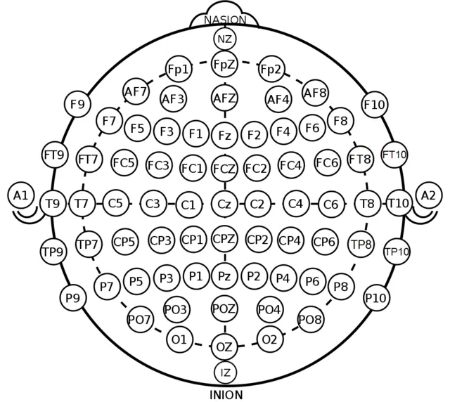
An EEG consists of multiple electrodes, each measuring activity from a different part of the brain (though there’s often a large overlap between those parts, as the EEG detects activity from a relatively wide area). Therefore “activity from one part of the brain” refers to the signals measured by the particular EEG electrode that’s positioned above that brain area.
How it’s done
Granger causality is calculated by testing whether past values of one time series improve the prediction of another time series beyond what its own past values can explain. In practice, this is done by fitting AR models and comparing their predictive power using statistical tests.
- We have 2 time series: X and Y. We want to test it X “Granger-causes” Y.
- We model Y using only its past values (AR models are usually used).
- We model Y using both its past values AND past values of X.
- Compare the 2 models. If the second model has lower prediction error than first model, then X “Granger-causes” Y.
- Perform the same check in the other direction (does Y “Granger-cause” X?)
What are the extracted features?
A matrix showing how much each the signal from each channel “Granger-causes” the signal from another channel.
Real-world examples
- Driving and Intuitive Risk Perception: A study placed participants in simulated driving tasks where they faced potential collision risks. They discovered that frontal regions (decision-making, executive control) Granger-caused parietal regions (spatial awareness) when drivers intuitively judged risk.
- This showed that risk perception is intuitive, not purely reactive. If the brain was purely reactive, we’d expect parietal/sensory regions (which process incoming visual/spatial information) to drive frontal regions (which then evaluate and decide). In other words, perception → evaluation. But instead frontal regions were found to drive parietal regions, suggesting that the brain is anticipating risk before sensory evidence fully unfolds.
-
Epilepsy and Seizure Propagation: EEG recordings from patients with focal epilepsy were analysed during seizures. Granger Causality was applied to track directional connectivity between electrodes. Seizure onset zones (often temporal lobe) were found to Granger-cause activity in other cortical regions, mapping the spread of abnormal discharges. This helps localize seizure origins and understand how seizures propagate.
- Emotion & Cross-Frequency Coupling: EEG was recorded while participants recognized emotional facial expressions. Granger causality was applied across frequency bands (theta, gamma). Theta activity in the frontal lobe was found to Granger-caused gamma activity in the temporal lobe, suggesting that slower oscillations in frontal regions modulate faster local processing in temporal areas. This shows how the brain coordinates different rhythms to process affective information.
5. Coherence
Coherence measures how 2 parts of the brain are connected. It shows functional connectivity - two brain regions that are oscillating together, but it doesn’t determine which part drives (causes) this relationship.
Coherence vs Granger Causality
Coherence tells us if regions oscillate together, Granger causality tells us which region drives which (directional influence).
How it’s done
Coherence is when 2 parts of the brain are transmitting the same signal (the same frequency and pattern). This implies that these parts of the brain are connected and sending information to each other.
In EEG, coherence is usually calculated between every pair of electrodes.
One problem is that sometimes the same signal can be picked up because multiple EEG electrodes are picking it up from the same place, rather that because the brain actually transmits it in multiple places. This phenomenon is called “volume conduction”
A way to tell whether it’s indeed coherence, or if it’s just volume conduction it to measure delay between the signal at seemingly different brain locations. If multiple brain locations are sending the same signal to each other, then there would be a small delay.
Coherence can be described with a complex number, where:
-
The real number shows how strongly signal from 2 parts of the brain are connected, but only considering the signals with no delay between them (so it might include volume conduction). It’s what we shown being calculated above, a number between 0 and 1, 0 meaning no connection, and 1 perfect connection.
-
The imaginary number also shows how strong the connection between 2 parts of the brain is, but it’s considering the signals that have a delay across the 2 parts of the brain (so it’s more likely to show real brain interaction)
The maths
- We calculate how much energy each signal has at each frequency (this is the Fourier transform)
- Then we calculate “cross-spectrum”. Cross-spectrum is a complex number, where the real element represents how strongly 2 signals are related at a particular frequency, and the imaginary element represents the delay at which the signals are related at that frequency. See the section below (“Partial Coherence”) for graphical representation of this process.
- At the end we normalise the cross-spectrum, by dividing the result by the strength of each signal (this is called “normalised cross-spectrum” or “coherency”).
- Then we take the absolute value of that. This is coherence.
What is the extracted feature?
Coherence matrix, showing coherence between all possible pairs of signals (electrodes). For an EEG with N electrodes, the size of the coherence matrix is N * N.
In some cases, only the real or only the imaginary numbers are used in the matrix.
Real-world examples
-
Brain-to-Brain Coherence in Social Interaction: Researchers measured interpersonal coherence between two people engaged in natural communication. They found that brain signals synchronized across individuals, showing how coherence can capture social neural coupling in real-world settings.
-
Infant Cognition and Language Development: Infants were recorded with EEG during early cognitive and language tasks. Coherence between cortical regions was measured as a marker of brain network development. Higher coherence predicted better later language and cognitive outcomes. Therefore coherence can serve as an early developmental biomarker, helping track and predict language acquisition.
6. Partial Coherence
Like coherence, the partial coherence method measures how 2 parts of the brain are connected. However, unlike coherence, the partial coherence method also removes indirect relationships and only measures direct relationships between signals.
What are direct and indirect relationships?
Let’s say we have 3 brain regions, A, B, and C. In coherence, we might see that A and B seem to oscillate together and be connected. However, we don’t know whether A influenced B directly, or whether A influences C, and then C influences B.
The maths
The steps for deriving partial coherence are as follows: cross covariance > cross spectrum > spectral matrix (matrix of cross spectrums) > precision matrix (inverse of the spectral matrix)
(1/4) Cross-covariance:
- What it does: It shows how much two signals are related to each other at different time lags.
- How to get it mathematically:
- Cross-covariance between 2 signals a and b for time lag τ is represented as R_ab(τ). Cross-covariance is the function of the time lag, which means that cross-covariance is calculated for all possible values of time lag.
- The components of the cross-covariance equation are as follows:
- The average value of a: μa
- The average value of b: μb.
- The value of a at a particular time t: a(t)
- The value of b at particular time t+τ: b(t+τ).
- The result of cross-covariance is how much the value of a(t) is associated with b(t+τ)
- To calculate this, cross-covariance considers a(t)−μa and b(t+τ)−μb. The average values are subtracted from the specific values a(t) and b(t+τ) to normalise them.
- Overall, cross-covariance calculates the average of these 2 values multiplied: (a(t)−μa)(b(t+τ)−μb).
- The result of the multiplication can be positive (= the 2 values are positively correlated at that time lag), zero (= the 2 values are not correlated at that time lag), or negative (= the 2 values are negatively correlated at that time lag).
- The higher the value of cross-covariance (whether positive or negative), the stronger the correlation at that time lag.
- Overall, the equation of cross-covariance is: R_ab(τ) = E[(a(t)−μa)(b(t+τ)−μb)]
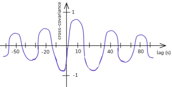
The result of the cross-covariance equation can be represented with a 2-d graph, where the x-axis represents the time lag, and the y-axis represents cross-covariance (=how closely the value of signal a is associated with value of signal b at that time lag).
As an example, let’s consider these 2 signals, A (green) and B (blue):
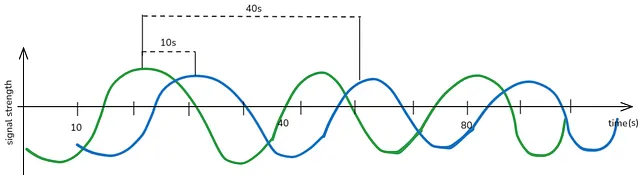
From the graph, we can see that B follows A at lag of 10 seconds (and A follows B at lag of -10 seconds) - if we take the graph of B and shift it 10 seconds to the left, the peaks and troughs of the 2 graphs will align.
B also follows A at a lag of approx. 40 seconds - if we take the graph of B and shift it 40 seconds to the left, the peaks and troughs of A and B will align, albeit not so strongly. This will also happen at approx. 70, 100, etc. (it will happen every 30 seconds, because that’s the distance between two peaks of a signal).
Therefore, the graph of cross-covariance R_ab would look as follows:
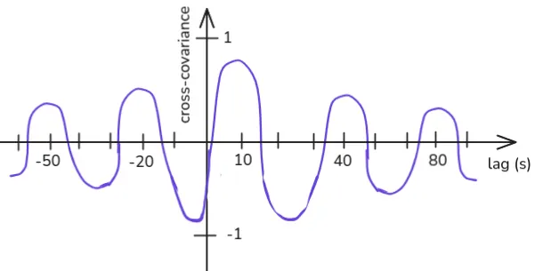
Cross-variance of R_ab is the same in value to R_ba, but it will be shifted in the other direction (it’s maximum value will be -10).
(2/4) Cross spectrum
- What it does: It shows how 2 signals are related to each other at different frequencies. It’s very similar to cross-covariance, but instead of showing correlation at different time lags, it shows correlation at different frequencies.
- How to get it mathematically: By taking the Fourier Transform of cross-covariance.
- How it’s represented: As a complex number - it has both real and imaginary component.
- Real component tells us how strongly the signals are related at a frequency.
- Imaginary component tells us about the delay at which the signals are correlated at that frequency.
An important thing to note is that cross spectrum represents a relationships between 2 signals (A and B), but this includes both direct and indirect relationships. There might be a third signal, C. If signal A influences C, and C influences B, the cross spectrum will show a strong connection between A and B, even if they don’t directly interact. We will remove these indirect relationships 2 steps from now.
The example graph below represents the cross spectrum of some signal A and B. In this simplified example, signal A is correlated with signal B at frequency of 20 Hz with the strength of “10” and the time lag of -5 seconds.
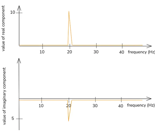
Cross spectrum of BA will have the same value as cross spectrum of AB, with the only difference that the imaginary component will be in the other direction.
(3/4) Spectral matrix:
To calculate spectral matrix, we’ll bring in a third signal - C. Then we’ll calculate cross spectrum for all combinations - AB, AC, BA, AA etc. The spectral matrix S(f) shows all these combinations at a particular frequency:
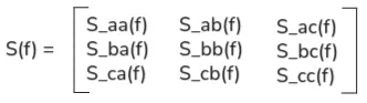
A specific numerical example could be as follows:

How to interpret the spectral matrix:
- Diagonal: power spectral density of each signal
- Off-diagonal: shared frequency content between signals. Importantly, as mentioned above, it captures both direct and indirect relationships. If signal A influences C, and C influences B, the spectral matrix may show a strong connection between A and B, even if they don’t directly interact. So how do we capture only direct relationships?
(4/4) Precision matrix:
- What it does: It shows only direct relationships.
- How it’s calculated mathematically: By taking the inverse of spectral matrix:
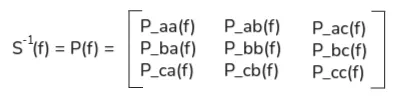
How to interpret it:
- If the entry P_ab is non-zero, it means A and B are directly related at frequency f, even after accounting for C.
- If it’s zero, then any connection between A and B is likely mediated through C.
A specific numerical example for the inverse of the spectral matrix shown at step (3/4) would be as follows:
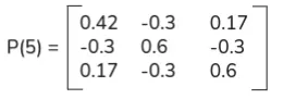
The precision matrix is the output of partial coherence. Inverting the spectral matrix isolates pure, direct links between signals, removing the influence of others.
⟶ Question: Why does inverting the spectral matrix remove indirect relationships?
⟶ Answer: The mathematical process of inversion isolates the unique, direct contribution of one variable to another, holding all other variables constant. For example, in a system of linear equations Ax = y the matrix A represents the combined, often indirect, influence of the variables x on the outcomes y. Solving for x by using the inverse, x=A^{-1} y yields the direct solution for x, effectively “undoing” the complex interdependencies and isolating the original values.
What is the extracted feature?
Precision matrix.
What can it tell us?
It’s widely used to identify the direct causes of things in the brain. For example:
- To identify the specific areas in the brain where seizures begin by finding the direct source of seizures
- To identify which neurons in the motor cortex are directly responsible for a particular movement
It can be also used to identify conditions such as Alzheimer’s, as it leads to reduced direct connectivity in motor and cognitive networks in the brain.
7. Directed Transfer Function (DTF)
DTF can identify 2 things:
- Whether 2 regions of the brain are connected
- Which region influences the other
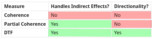
Difference between DTF, Coherence, and Partial Coherence
DTF can measure in which direction the relationship between 2 regions in a brain flows. Coherence and partial coherence can measure the strength of this relationship, but not its direction.
DTF vs Granger Causality
They’re both tools for studying directional connectivity in EEG.
Granger Causality is typically applied in the time domain. DTS is applied in the frequency domain - it shows directional influence at specific oscillatory bands (e.g., theta, alpha, gamma).
Granger Causality is usually pairwise - it tests influence between two signals at a time. DTF is multivariate - it considers the whole system of signals simultaneously, not just pairs.
Granger Causality asks “Does A’s past predict B’s future?”. DTF asks “How much does A contribute to B at a given frequency, considering the whole network?”
Granger Causality is good for small systems or when we want clear pairwise directional relationships. DTF is good for complex network-level EEG connectivity.
How it’s done
DTF relies on calculating the transfer function H(f). H(f) is defined as such:
X(f) = H(f) * E(f).
It’s a function like y=ax, though defined more strictly (for example, both input and output need to be signals).
- X(f) represents the output - in this case, the output are EEG signals recorded from the brain (defined in the frequency domain rather than the time domain, which basically means taking their Fourier transform)
- E(f) represents the input - in this case, the input is the noise, same as the noise in the AV model. Noise is not just random static with no explanation, but it’s the part of the EEG signal we can’t predict using a model as it’s not explained by past EEG signals - this could be due to micro-scale processes like synaptic noise or external inputs such as sensory stimuli - representing input that will lead to a change in the overall EEG signal (output).
- H(f) is the transfer function matrix, representing how input is mapped to output.
H(f) describes how input E(f) is transformed into output X(f). Essentially, this describes how parts of the EEG signal that we can’t predict using a model, representing input, result in the EEG signal that’s “outputted” from the brain.
For 2 channels, H(f) will looks like this:

Let’s take H_12(f) as an example. H_12(f) describes how the input from the 2nd channel - E_2(f) - is mapped to the output of the 1st channel - X_1(f). Meaning, H_12(f) describes how 2nd channel drives the 1st channel.
Conversely, H_21(f) describes how 1st channel drives the 2nd channel.
DTF_ij =/= DTF_ji. If DTF_ij is high but DTF_ji is low, it means j is driving i, not the other way around. This is how DTF indicates the directionality of the relationship.
Overall:
H(f) is a matrix.
- The columns j correspond to inputs - E(f).
- The rows i correspond to outputs - X(f).
- Thus, the element H_ij is the mapping from input j to output i.
Essentially, H_ij answers the question: “if we inject energy into channel j at frequency f, how much of it will show up in channel i?”
DTF is just a normalised version of H_ij, where each value will be between 0 and 1.
The maths
Calculating DTF involves the following steps: calculating coefficients of the MVAR model -> rewriting the coefficients in terms of time lag -> switching from time domain to frequency domain -> inverting the matrix to get the transfer function -> normalising to get the Directed Transfer Function.
(1/5) Coefficients of MVAR
We calculate the coefficients of the MVAR model, as described in the section “2. Coefficients of the AR model”.
(2/5) Rewriting the coefficients in terms of time lag
At this point we have the MVAR equation X_t = A_1 X_(t-1) + A_2 X_(t-2) + … A_P X_(t-p) + e_t. We will rewrite this equation in terms of time lag L.
Lag operator L means “shift the series back by one time step.”
For example:
- L * X(t) = X(t‑1)
- L² * X(t) = X(t‑2)
This way, instead of writing out every past value explicitly, we use powers of L to represent lags with different time steps. The purpose of the lag operator is to simplify notation and make some mathematical operations easier.
The equation of MVAR coefficients can be rewritten using the lag operator as such:
-
Original MVAR equation X(t) = A1 * X(t-1) + A2 * X(t-2) + … + Ap * X(t-p) + ε(t)
-
Moving signal terms to the left-hand side: X(t) - A1 * X(t-1) - A2 * X(t-2) - … - Ap * X(t-p) = ε(t)
-
Replace each lagged signal by lag notation Replace X(t-1) by L * X(t) Replace X(t-2) by L^2 * X(t) etc. X(t) - A1 * (L * X(t)) - A2 * (L^2 * X(t)) - … - Ap * (L^p * X(t)) = ε(t)
-
Factor X(t) out [I - A1L - A2L^2 - … - Ap*L^p] * X(t) = ε(t) I is the k×k identity matrix; it multiplies X(t) to represent the “current” term.
-
Make it more compact A(L) * X(t) = ε(t), where A(L) = I - A1 * L - A2 * L^2 - … - Ap * L^p
The final value is A(L) * X(t) = ε(t), where A(L) = I - A1 * L - A2 * L^2 - … - Ap * L^p
A(L) collects all the lagged coefficient matrices into one compact polynomial expression. At this point, L is just a symbolic operator representing “shift back in time”.
(3/5) Switching from time domain to frequency domain
At this point, we have the equation A(L) * X(t) = ε(t), where time “t” is a variable.
L represents time lag. Therefore, A(L) expresses past values of EEG signal in terms of their time lags (we’re in the time domain). But we want to express the past values in terms of their frequencies instead (we want to move to the frequency domain).
- Why? Because if we can see how signals interact at specific frequencies, that makes directional influences easier to interpret.
- Again, why?
- Because in the time domain, the past values contain all frequencies mixed together.
- If channel A drives channel B, we can see the dependence, but we can’t tell what frequency is responsible. For example, does channel A drive channel B at 10 Hz (alpha) or at 40 Hz (gamma)? 10 Hz might represent attention, while 40 Hz might represent sensory processing.
- Therefore, in the frequency domain, we can link the directional influences to specific processes, rather than overall dependence seen in the time domain.
- Because in the time domain, the past values contain all frequencies mixed together.
To move from the time domain to the frequency domain, we do Fourier transform. A(L) is not a signal, so Fourier transform has a different purpose in this case.
- Fourier transform of a signal → tells you its frequency content.
- Fourier transform of A(L) → tells you how the operator A(L) acts at each frequency. It will tell us how the combination of lagged terms amplifies or attenuates signal at frequency f (how they change the magnitude), and how the lagged terms shift signals in time at frequency f (how they change the phase)
(4/5) Transfer Function
At this point, we have: A(f) * X(f) = E(f). We will now use matrix inversion to rewrite this equation in the correct form for the transfer function X(f) = H(f) * E(f)
-
We invert A(f) which results in A(f)^-1. Then we multiply both sides of the equation by this inverted value A(f) ^-1 * A(f) * X(f) = E(f) * A(f)^-1
-
A(f)^-1 * A(f) cancel each other out. We’re left with: X(f) = E(f) * A(f) ^-1
-
A(f) ^-1 is H(f). We now have the transfer function: X(f) = H(f) * E(f)
(5/5) Normalising to get DTF
At this point H(f) is raw and unbounded. All that remains is to normalise it, so we for each entry we get a value between 1 and 0.
To obtain DTF from H(f), we take the following steps:
- Take the squared magnitude of each entry (H_ij²).
- For each output i, add up all the inputs (sum over j). Then divide each H[i,j]² by that sum. This is to normalise the entries row-wise.
- The result is DTF.
What is the extracted feature?
The N-dimensional matrix DTF(f), which for each frequency f, the entry DTF[i,j] tells us the amount of directional influence of channel j on channel i.
Real-world examples
-
Motor Imagery and Classification: Researchers applied DTF to EEG signals during motor imagery tasks (imagining left vs. right hand movement). DTF revealed directional connectivity patterns in the alpha (8–13 Hz) and beta (13–30 Hz) bands, which differed across subjects. These frequency-specific directional features improved classification accuracy in BCI systems, making them more reliable for assistive technologies.
-
Emotion Recognition: EEG recordings were analysed while participants experienced positive, negative, and neutral emotional states. Using both Granger causality and DTF, researchers measured which brain regions were driving each other.
- Frontal regions (involved in regulation and evaluation) were found to drive temporal regions (involved in memory and emotion recognition). This indicates that emotion recognition involves top-down regulation (frontal cortex guiding temporal/limbic processing) rather than being purely reactive. It shows how emotions are not just “felt” but actively shaped by directional brain communication.
- Negative emotions showed stronger frontal-to-temporal influence in theta bands. Positive emotions involved more bidirectional connectivity in higher frequencies (beta/gamma). This suggests a dynamic dialogue between regions for positive emotions, and top-down control for negative.